Website Revamp - Recon
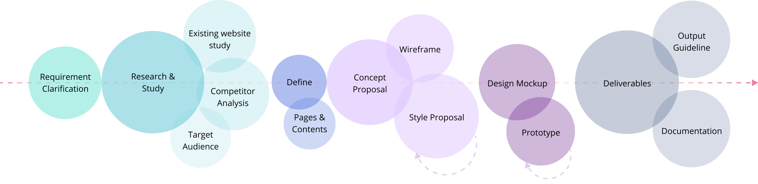
Project Process
My Role
UX/UI Designer
Scope
Redesign the whole webstie with trendy UI and better user experience
Existing Problems
Overall
- One long page for the whole site, so many information needed to be digested for users
- The logic of the layout structure is week
- So it is not telling a story
Detail parts
Banner Section
- The background image is not related to the product
- Users might be confused with what is RECON for until s/he read the text
- The slogan is not outstanding enough
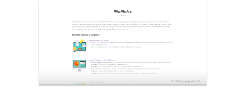
Who We Are Section
- Too many texts to read
- Logically, Benefits & Feature to Merchants are supposed to be part of Who We Are
- This section is too long with 3 parts
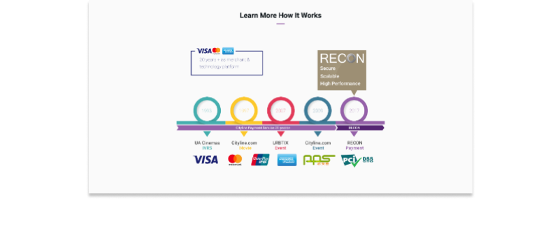
Learn More How It Works Section
- This is more like the history of RECON
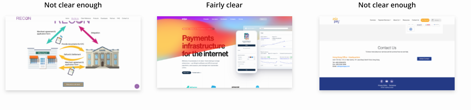
- And the infographic is not presenting the right message. E.g. I thought the 6 logos at the bottom is for different platforms and they are not.
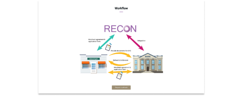
Workflow Section
- Request a call back as a CTA Button, is not outstanding enough
- The overall location of CTA button is not very obvious. Placing here with no reasons
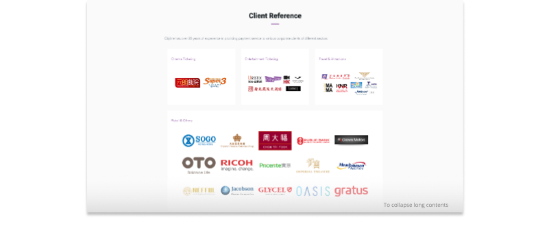
Client Reference Section
- Spending too much spaces for displaying the clients' logos, users will not go through everyone out here
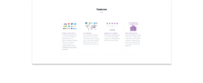
Feature Section
- Too many texts to read

Services Section
- The information of each infographic is not clear enough
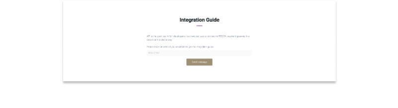
Integration Section
- It is not clear for what types of users
- The guide is not clear enough
- Users need to read the text and then take actions after considering
- Users will not know it is asking for a document
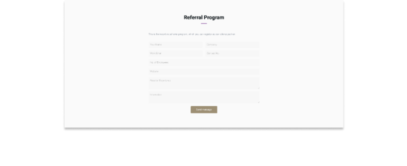
Referral Program Section
- It is not clear for what types of users
- Like a contact form
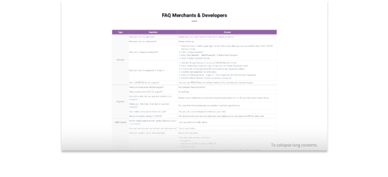
FAQ Merchants & Developers Section
- The title is confusing
- There is too redundant for displaying all the FAQ in Home Page
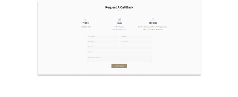
Request A Call Back Section
- It is also like a contact form
- But what's the differences between this one and the one in "Referral Program Section"
Competitor Research & Analysis
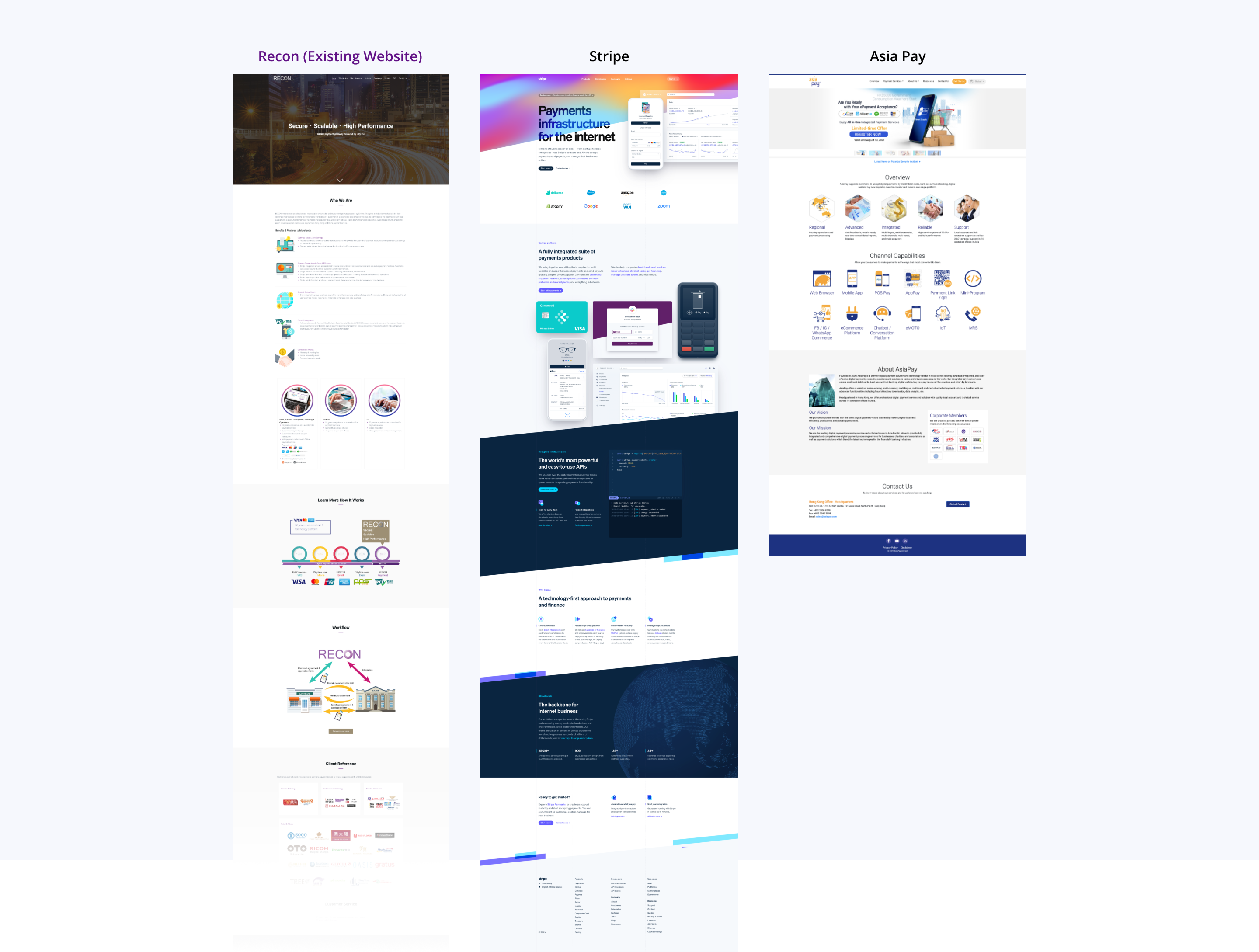
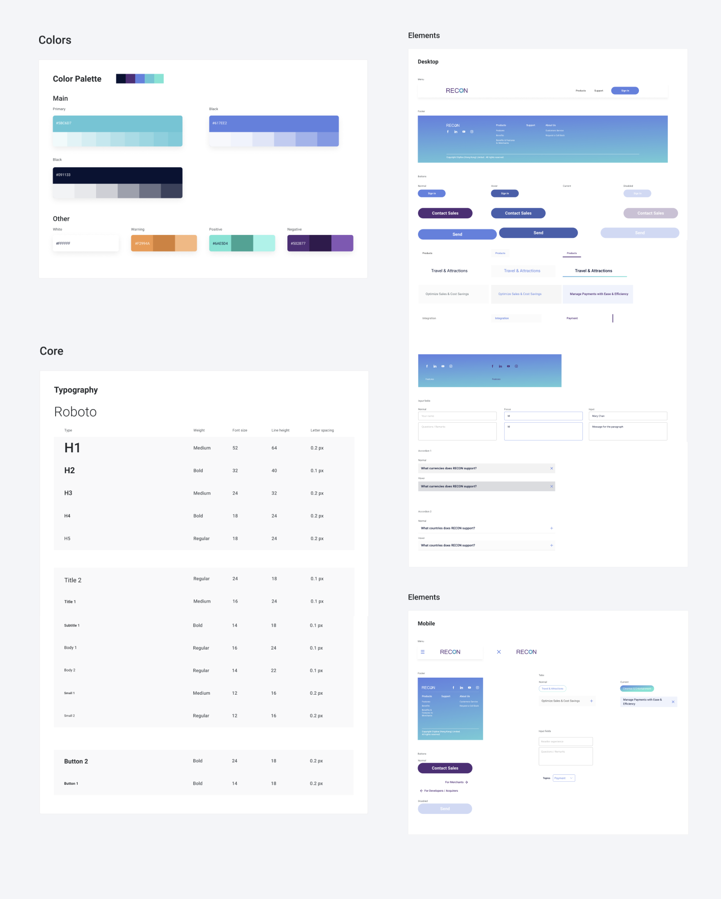
Color Palatte

Call-to-Action
Mobile Device

Page Layout

What I think it good

What I don't think it good

Target Audience
Who will view this website and take actions?


Design Concept
Let the website tell a story
Journey
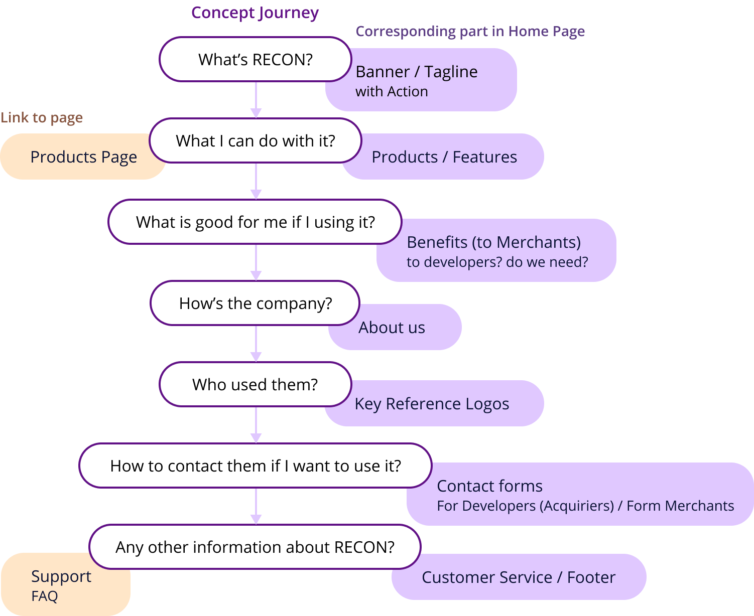
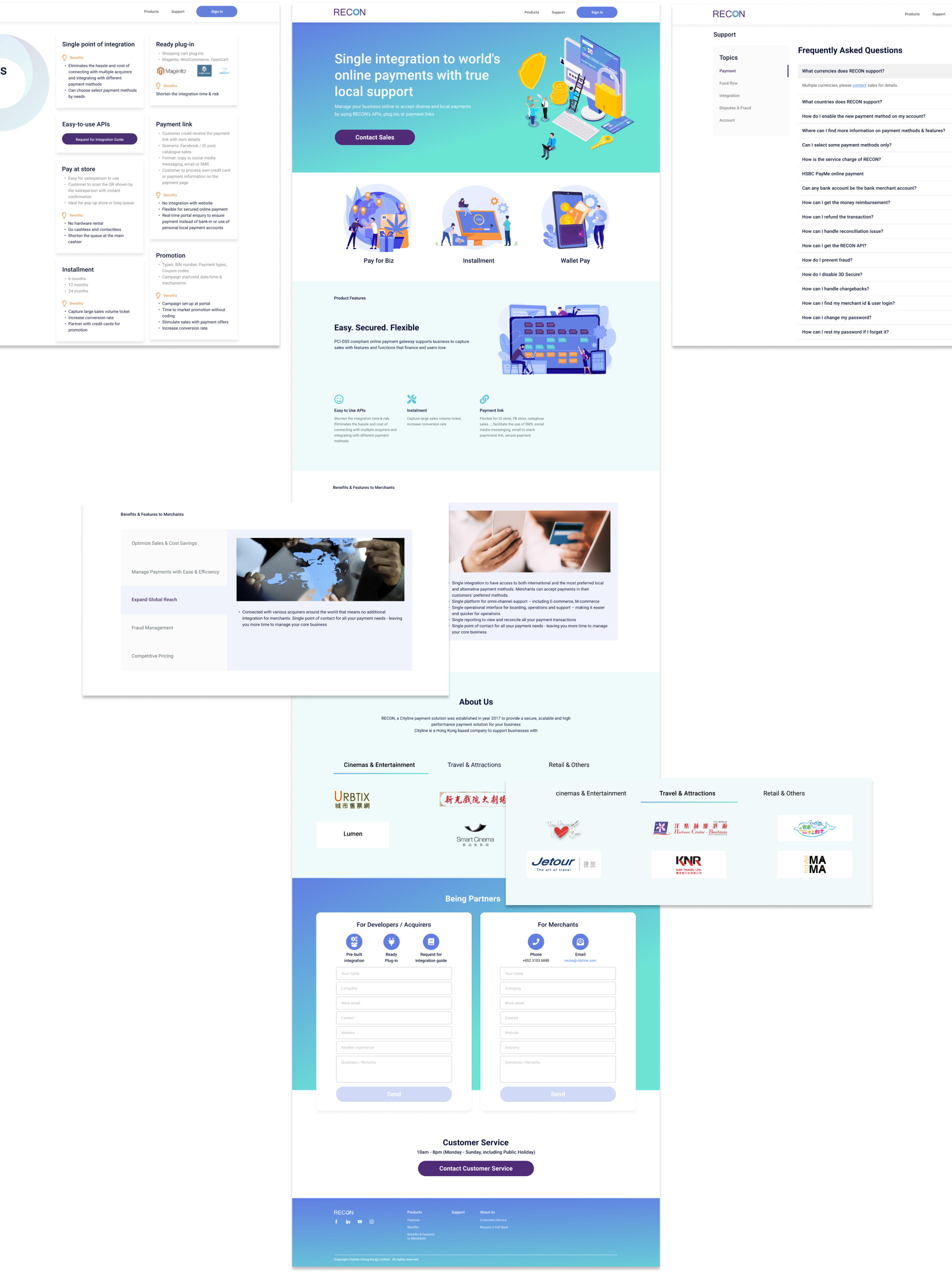
Wireframe
Home/Landing Page
Other Pages
Color Scheme
Color Version
Style 1

Use the purple of brand logo and combine solid blue as the main color
Style 2
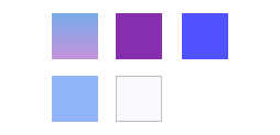
Use gradient with bold purple and sharp blue as the main color
Style 3

Breakthrough the original color scheme and try a trendy style
Draft Mockups
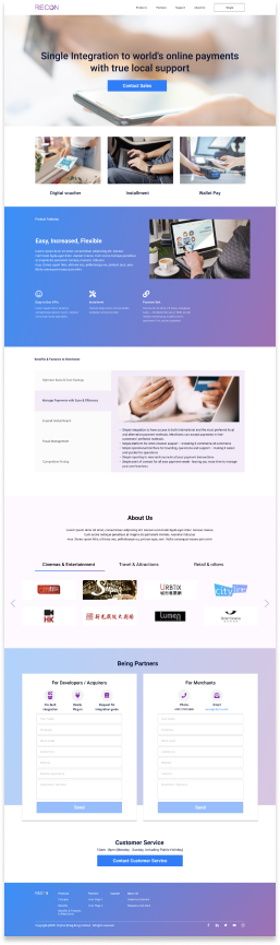
- Use professional images cross the whole website
- Apply different level of gradient to some elements and as background color of some sections and footer
- Use triangle as main button shape, to be stronger and more powerful
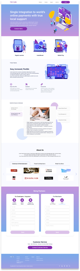
- Use trendy illustrations cross the whole website
- Apply circle as a key element to some backgrounds and decorations
- Use rounded button with bold purple, to be softer and more approachable
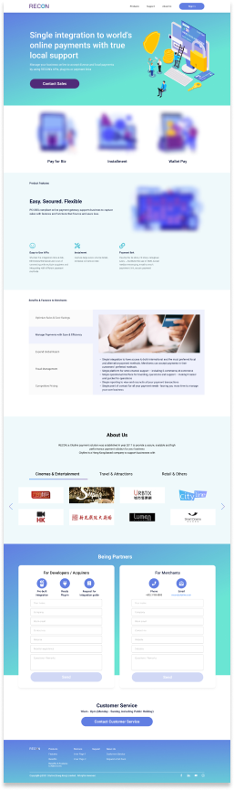
- Use trendy illustrations cross the whole website
- Use rounded button with bold purple, to be softer and more approachable
- Different color scheme from v2
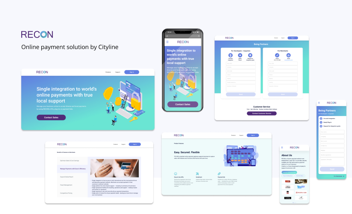
Final Design
Desktop Version
Mobile Version
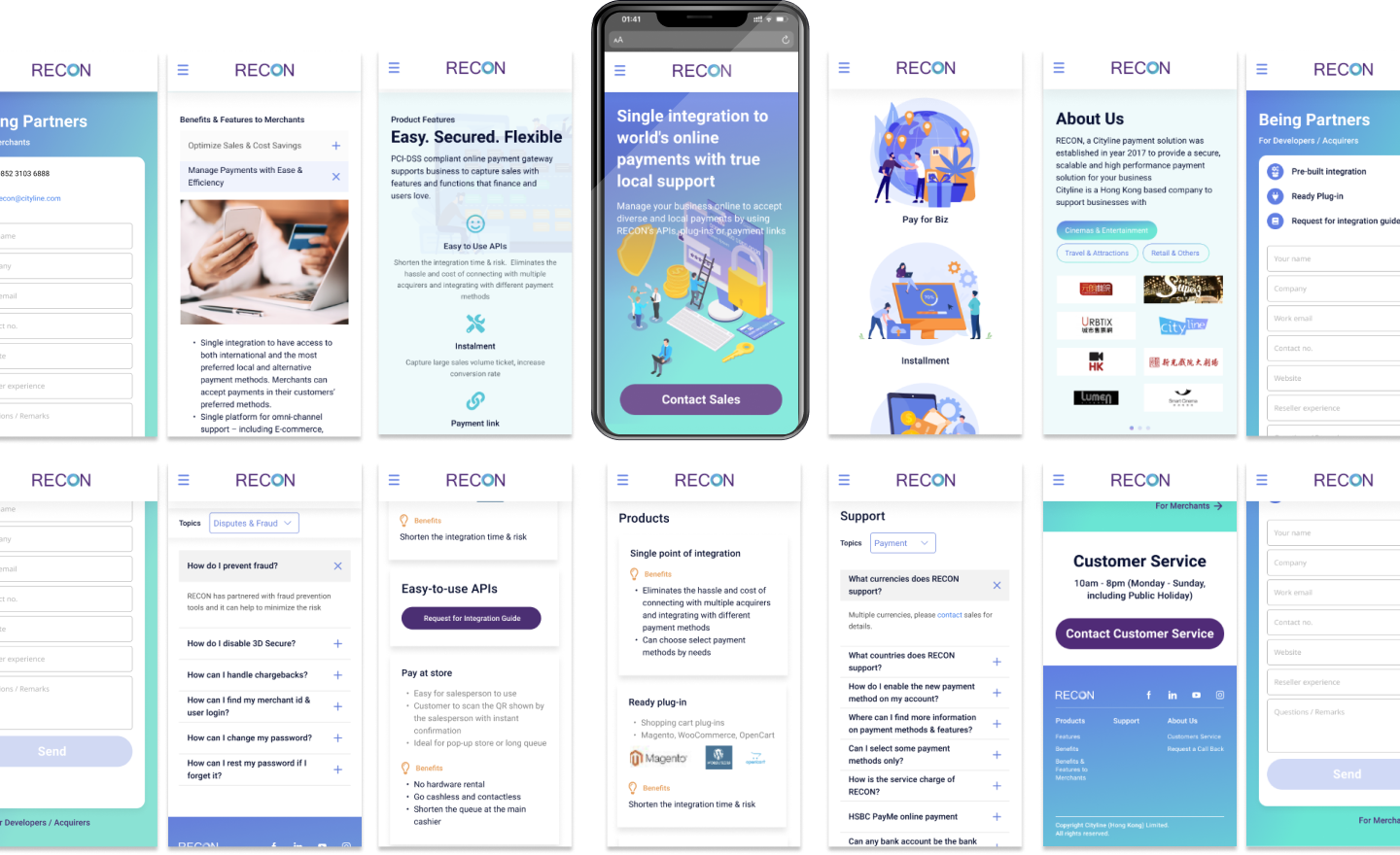
Design Guidelines